Role
Product Designer
Platform
B2B, SaaS, Webapp
Timeline
2023-2024
challenge
The challenge was that this transformation needed to retain essential functionalities while ensuring seamless integration, without disrupting the user experience or compromising efficiency.
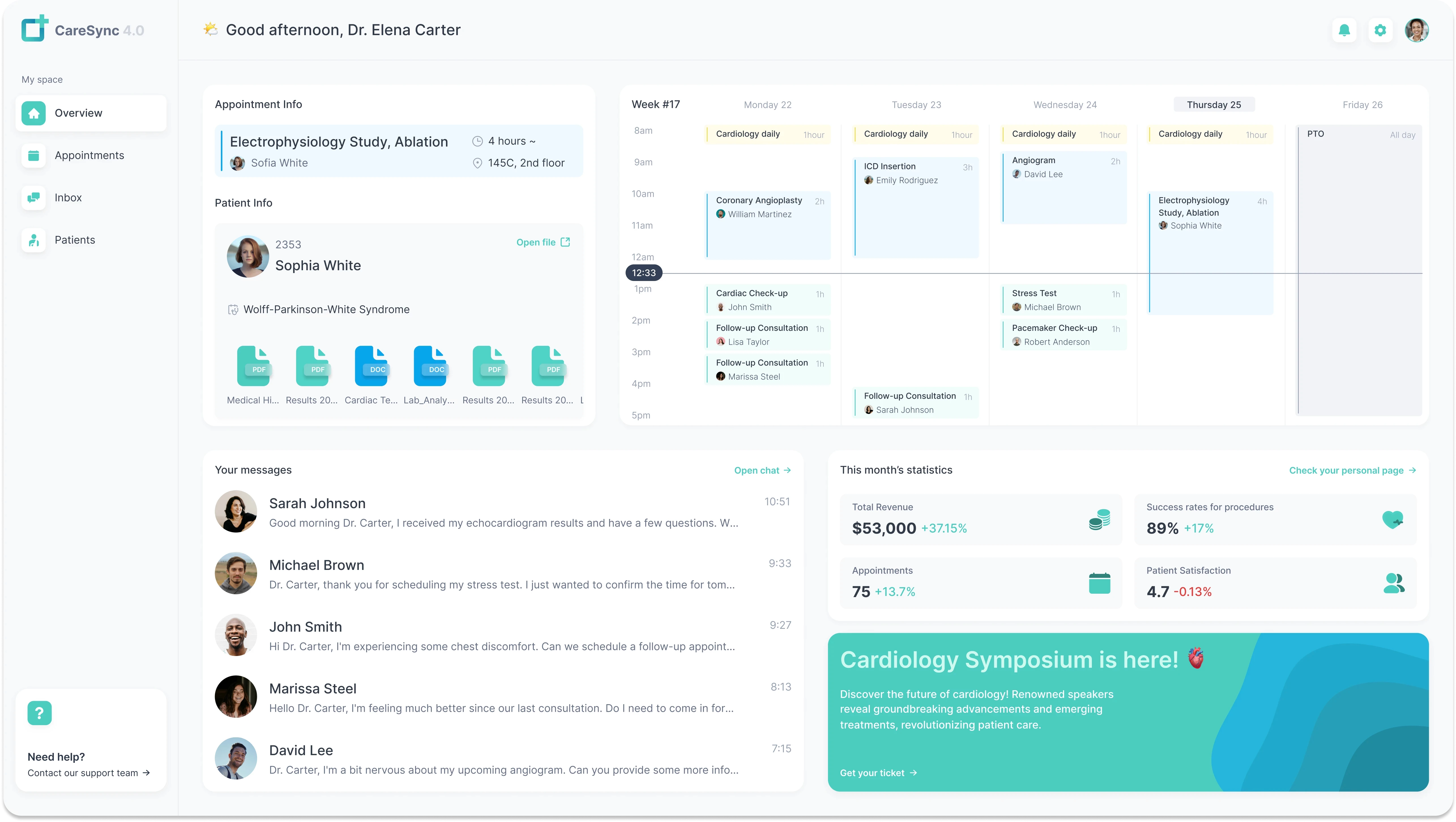
CareSync 3.3, a platform primarily used by doctors for managing appointments, patient files, and internal communication, was limited to a single level of access. The hospital recognized the need to expand this platform to accommodate its complex hierarchical structure.
CareSync was initially developed to:
1/ improve business operations
Shift from traditional paper-based patient records to a digital system, centralizing all crucial medical data.
2/ enhance user experience
Facilitate interaction between healthcare providers and patients by offering a platform for easy communication and data access.
However, the platform was limited to doctors, leaving administrative staff and executives without a unified system to manage hospital operations. Recognizing this gap, the goal was set to expand CareSync's reach across all hierarchical levels.
Before diving into solutions, it was crucial to explore the existing system, understand user needs, and identify opportunities for improvement. This phase involved deep research into both the technical and organizational aspects of CareSync 3.3. The goal was to ensure that any redesign would not only address usability challenges but also align with the hospital’s operational workflow.
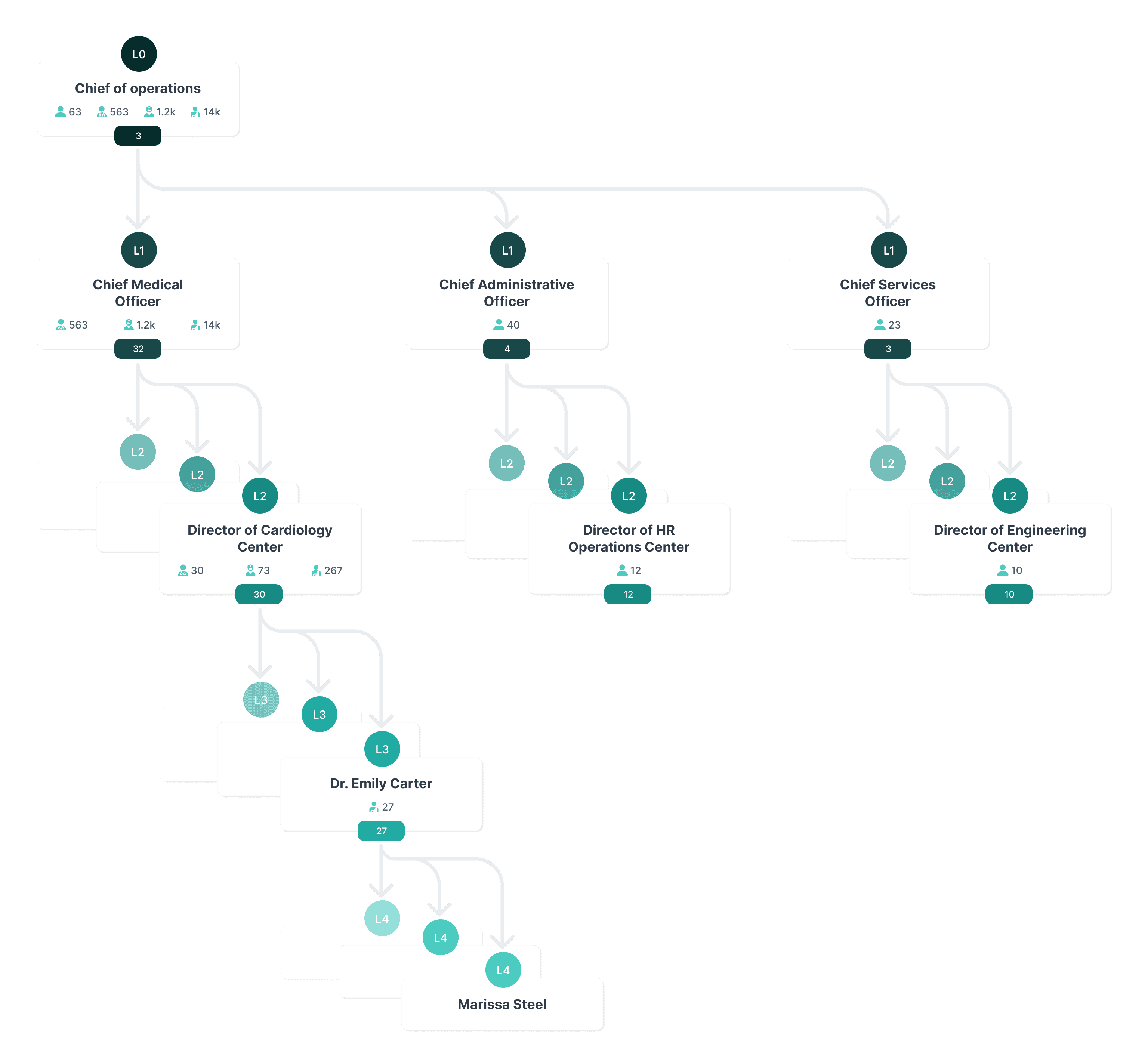
To design an effective multilevel platform, it was essential to understand the hospital's organizational structure thoroughly. This involved:
1/ hierarchical mapping
Creating detailed diagrams of the hospital's departments, roles, and reporting lines. This helped identify how information flows within the organization and where bottlenecks occurred.
2/ user needs analysis
Conducting interviews and surveys with representatives from each user group, including doctors, nurses, administrative staff, department heads, and executives. This provided insights into their specific tasks, challenges, and requirements from the platform.
This involved closely examining the existing application layout to gain a comprehensive understanding of its strengths, weaknesses and limitations.
1/ sidebar navigation
This represented the key component to navigate through the app.
Overview: displayed the most important information for a doctor. Each widget of the dashboard worked as a compressed view of more complex screens from the app
Calendar: allowed doctors to schedule and manage appointments efficiently.
Patients: to manage patients, view their files(containing appointments notes, medical history and personal information about the patient).
Inbox: an easy and fast way to get in touch with the patients but also with other healthcare professionals within the hospital.
2/ page header
This contained the current page name on the left, but also some important account related buttons on the right: notifications, settings and account info.
3/ page content
The page content was very diverse depending on on the page: cards, widgets for dashboards, calendar and other resources.
A key part of this process was mapping out the user journey to visualize how different roles within the hospital interacted with CareSync. This helped identify friction points, gaps in functionality, and opportunities to create a more intuitive, scalable experience.
One of the most critical personas in this transformation was the Hospital Administrator, who needed seamless access to operational data, staff coordination tools, and high-level reporting features. Below is a journey map illustrating their experience with CareSync before and after the redesign.
Key Takeaways
→ Lack of centralization forces admins to rely on multiple tools (emails, spreadsheets, phone calls).
→ Manual reporting is inefficient and prone to errors, increasing workload.
→ A real-time dashboard, role-based access, and automated reporting would significantly improve efficiency.
GOAL: "Scale CareSync 3.0 into a multilevel management platform, CareSync 4.0, that provides various levels of access and visibility."
1/ core functionalities
The main page content and essential features that users relied on were retained to ensure continuity and reduce the learning curve.
2/ patient files flyout
Recognized as a crucial feature for doctors and other medical staff, this component was preserved and enhanced to support additional data relevant to other user roles..
1/ sidebar navigation
Required a complete redesign to accommodate the multilevel structure: introduce tree view structure to organize content efficiently.
2/ page header navigation
Add secondary navigation aids, such as breadcrumb trails, to improve path visibility and ease of navigation, especially for higher-level users accessing deep hierarchical levels.
With a clear understanding of user needs, the next step was to scale and adapt CareSync 3.3 to support multiple hierarchical levels while ensuring a seamless user experience. The redesign focused on restructuring existing content to provide relevant access and visibility for different roles within the hospital.
1/ enhanced dashboard
Pain point
Users across different hospital roles had varied data needs but were restricted by a one-size-fits-all dashboard, leading to clutter for some and missing information for others.
Solutions
2/ defined a flexible page pattern
Limitations in CareSync 3.3
Solutions
→ Expanded the page structure to support multiple resource types across all new hierarchical levels.
→ Introduced a table view option for managerial roles, enabling them to efficiently process larger datasets. At the same time, maintained the card-style layout for roles that needed quick, visually distinct patient summaries (e.g., doctors).
→ Ensured consistency with other hospital management tools by aligning table views with existing workflows.

3/ defined a flyout pattern: provide a preview panel for various resources
Limitations in CareSync 3.3
→ The flyout panel was built exclusively for patient data visualization. It included specific features such as appointment summaries and medical history documents but was not adaptable for other types of hospital data.
→ Lacked flexibility for roles beyond doctors, limiting its usability for administrative and managerial staff.
Solutions
→ Expanded the flyout panel to support multiple resource types, including patients, doctors, clinic centers, and chief officers.
→ Added role-specific data previews, allowing different users to access key information relevant to their responsibilities.
→ Improved navigation within the flyout, enabling quick access to additional details without leaving the current workflow.
→ Maintained the intuitive structure for patient-related data while ensuring scalability across all new levels of the app.

Things got complicated and a little too crowded in the SideBar for Level3: it could end up looking as a long list of pages. In order to compress and visually declutter the content, I added a tree view structure that compressed all the information found in the levels below.
Pain Point
After completing user testings on the final NavigationBar design, we found out that higher level users had problems navigating al the way to the last level, and remembering the path.
Solution
Implemented a breadcrumb trail to improve navigation for higher-level users, enhancing path visibility and offering a secondary navigation scheme, making it easier for users to backtrack through the hierarchy.
The redesigned CareSync 3.3 successfully scaled to accommodate the hospital’s complex hierarchy, improving accessibility and efficiency across all user levels. By restructuring key interfaces and introducing flexible navigation patterns, the platform became more intuitive and aligned with the needs of both medical and administrative staff.
1/ problem
The platform was limited to doctors, excluding administrative staff, department heads, and executives, leading to fragmented operations.
2/ solution
Redesigned CareSync to include user roles across all hierarchical levels, providing tailored access and functionalities to each group.
3/ results
User Base Growth: Increased by 150%, extending accessibility to a broader range of hospital staff.
Operational Efficiency: Boosted by 200%, as administrative tasks became more streamlined and communication improved.
Performance Insights for Executives: Improved by 170%, enabling data-driven decision-making through accessible analytics and reports.
1/ problem
The original app architecture could not accommodate future growth, additional departments, or expansion to other locations.
2/ solution
Redesigned the sidebar navigation and integrated Workspaces to allow for seamless addition of new departments, services, and even multiple hospital sites.
3/ results
Scalable Architecture: CareSync now supports easy integration of new functionalities and user groups without the need for significant redesign.
Future-Proofing: Positioned the platform to adapt to the hospital's evolving needs, including potential expansion into new regions.


