role
Product Designer
platform
iOS
timeline
2022
challenge
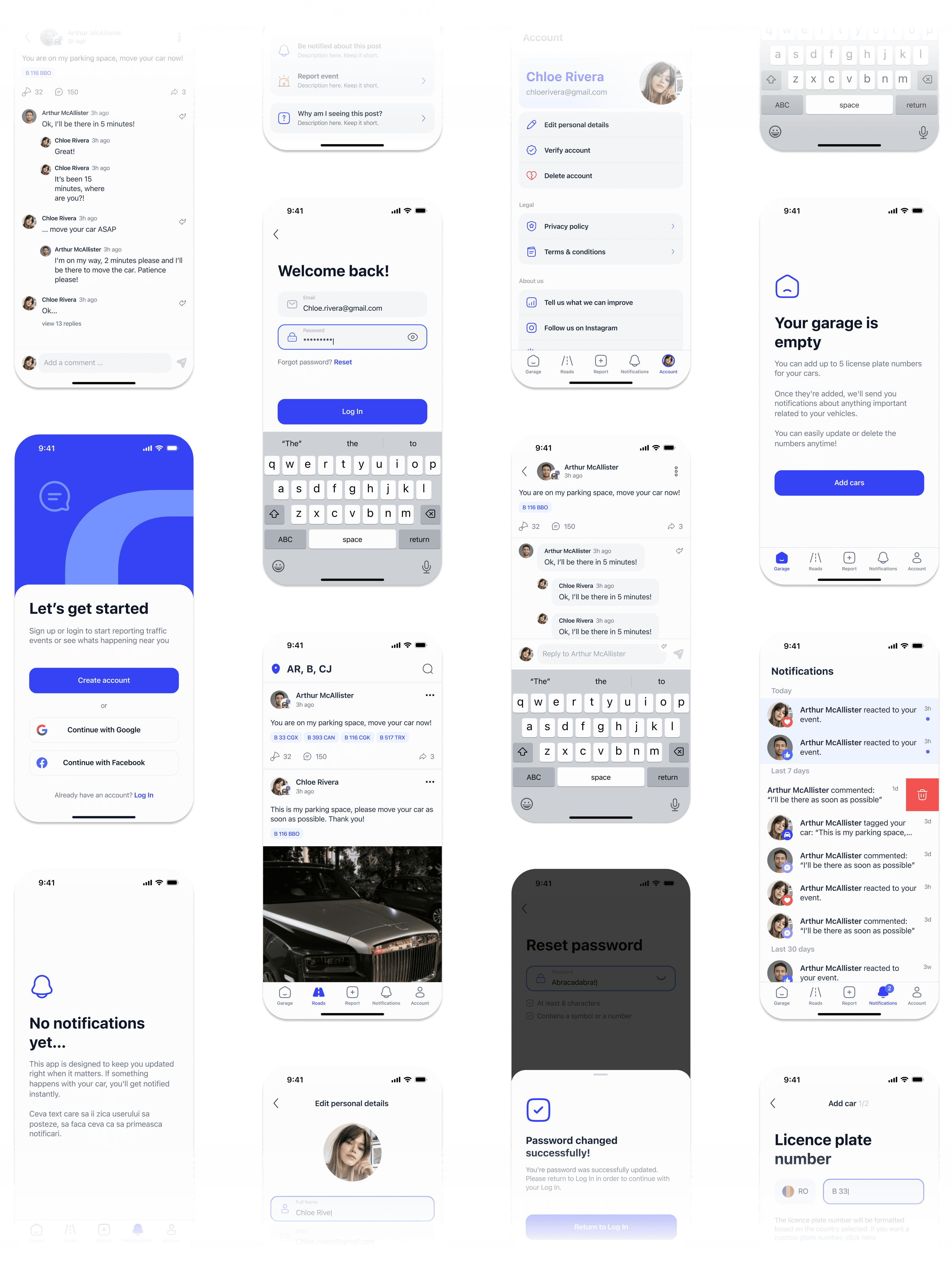
The primary challenge was to completely overhaul the application to modernize its UI, enhance its functionality, and create a seamless user experience for individuals dealing with parking problems in Bucharest.
approach
My objective was to redesign RoadTalk by employing user-centered design principles to not only update its aesthetic appeal but also to improve its functionality and user satisfaction comprehensively.
In Bucharest, the scarcity of parking spaces leads to frequent unauthorized parking in designated spots, causing considerable frustration among drivers. It is common for individuals to park in someone else's allocated parking space, sometimes leaving a phone number for contact but often not, complicating the resolution process
Alerta Trafic Romania was designed to address this pervasive urban issue by allowing users to tag a vehicle's license plate and notify the owner directly, thereby streamlining the process of resolving parking disputes and reducing stress.
To acquire an in-depth grasp of user requirements, patterns, and challenges, I carried out thorough studies encompassing:
user interviews, surveys
Engaged with existing users to gather qualitative insights on their experiences, frustrations, and suggestions for improvement. Deployed surveys to collect quantitative data on user behaviors, preferences, and demographics.
competitive analysis
Reviewed similar applications and active Facebook communities dedicated to traffic and parking issues in Romania to identify best practices and user expectations.
analytics review
Analyzed app usage data to identify drop-off points, frequently used features, and areas with high error rates.

parked on in a handicapped spot
lifted car noticed in traffic
hit-and-run
accident noticed
A well-designed user interface is more than just aesthetics, it’s about clarity, consistency, and trust. The next changes not only elevated the app’s appearance but also strengthened user confidence and interaction.
enhanced UI and provided consistency
The user interface lacked modern design elements and consistency across different screens, leading to user confusion and diminishing trust. Established a design system to ensure uniformity in UI elements throughout the app.
before
after
built a voice
The absence of a strong visual identity made it difficult for the app to stand out, reducing user engagement and loyalty.
I focused on creating a clean, modern aesthetic that emphasized simplicity and familiarity. The color palette was updated to be more vibrant and welcoming, while consistent typography and intuitive iconography were introduced to improve user experience and enforce a cohesive branding.

Great user experiences remove friction, guide users seamlessly, and build engagement. In this project, I optimized the onboarding process, improved form usability, and introduced smart validation to reduce errors. These changes not only streamlined interactions but also enhanced user retention and satisfaction.
spalsh screen
The original splash screen lacked a compelling value proposition and offered limited sign-up options, which contributed to user drop-offs. Including multiple sign-in options, such as Facebook and Google, catered to user preferences and reduced friction during onboarding, as a significant portion of our user base was coming from Facebook.
before

after

create account
Creating an account was a single-screen form, where the keyboard often hid the CTA button, making it difficult for users to proceed. Additionally, the form allowed users to enter incorrect or incomplete information, as there was no input validation in place, leading to a significant drop-off during onboarding.
Replaced the single-screen sign-up form with a multi-step wizard to reduce cognitive load and guide users through the process more effectively. Implemented real-time validation rules for email addresses and passwords, accompanied by helper texts to provide guidance and reduce errors.
before

after

onboarding
Onboarding was missing. After the email confirmation, the user was directly redirected into a feed full of data, with the default location set to Bucharest. This caused confusion because users were not familiar with the shown content and did not understand how to change the location, which is a key feature of the app.
Implemented an informative and engaging onboarding process to acclimate users to the app's features and navigation. Using empty states and including call to action buttons encouraged the user to engage with the app's features.
before

after

car plate input
The process of adding a car licence plate lacked proper formatting rules, allowing users to enter completely random numbers without validation, which led to user frustration and inconsistencies.
Implemented formatting guidelines based on country rules for license plate entries, ensuring accurate data input and enhancing the core functionality's reliability. The custom plate number option was transformed into a feature, because a lot of our users liked to use nicknames for their cars.
before

after

This project led to significant improvements in user engagement, onboarding efficiency, and conversion rates, ultimately driving business growth. The key outcomes include:
Increased user engagement
The number of reported parking issues increased by 50%, indicating higher user interaction with core features.
Improved conversion rates
Account creation rates rose by 40% due to the streamlined sign-up process and the addition of social sign-in options.
Reduced onboarding drop-off
The drop-off rate during sign-up decreased by 35%, demonstrating the effectiveness of the new onboarding experience.
Business Growth
The increase in active users and engagement contributed to higher revenue through in-app advertisements and potential partnerships.


